
A control chart with no out-of-control points is good news about consistency. It says nothing about whether that consistent process actually fits inside your spec.
It's a genuinely common outcome, and it trips people up every time: the X̄–R chart is clean. No points beyond the control limits, no runs, no obvious trends — every signal you were trained to look for says "stable." Then Cpk comes back at 0.85, and the instinct is to distrust one of the two results. Usually there's nothing wrong with either. They're just not measuring the same thing.
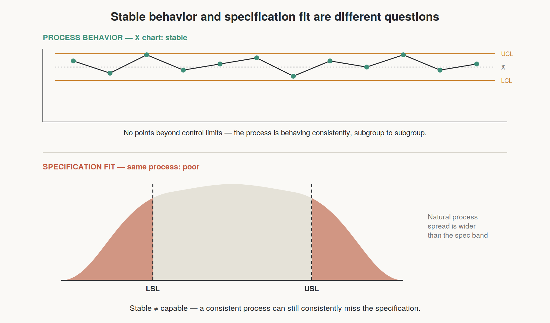
Stability and capability are independent axes
A control chart answers one question: is the process behaving consistently over time, governed only by common-cause variation, with no special causes disrupting it? "In control" means the process is predictable — not that its output is good.
Capability answers a completely different question: given how the process actually behaves, how much of its output falls inside the specification limits? A process can be perfectly stable and still be too wide, too far off-center, or both, relative to what the spec requires.
Put simply: control charts describe the process's behavior. Capability indices describe the process's fit to a target. You can have consistent behavior that consistently misses the target.
Why "stable" gets misread as "capable"
Part of the confusion comes from how these tools are usually taught in sequence — students learn control charts first, learn that out-of-control points are bad, and absorb an implicit lesson that "no out-of-control points" equals "good process." It's an easy generalization to make and a wrong one. A control chart has no concept of specification limits at all. UCL and LCL are calculated purely from the process's own observed variation (using constants like A2, D3, D4 applied to your subgroup ranges) — they have nothing to do with where your customer's tolerance sits.
It's entirely possible, and common, for a process's natural control limits to sit comfortably inside spec (great capability) or to sit wider than spec (poor capability), while the chart itself looks equally "clean" in both cases. The chart can't tell the difference, because that's not the question it's built to answer.
What a stable-but-incapable result is actually telling you
Once you've confirmed the process is stable — and that confirmation matters, because a capability number computed on an unstable process is not trustworthy in the first place — a low Cpk with a clean chart narrows the problem down to two possibilities:
The process is off-center. Compare Cp to Cpk. If Cp (potential capability, ignoring centering) is noticeably better than Cpk (actual capability, accounting for where the process sits), the spread itself is fine but the process is running off-target. This is usually the more fixable problem — an adjustable offset, a setpoint correction, a fixture alignment.
The process is too spread out, even when centered. If Cp itself is low, the natural variation of the stable process is simply wider than the tolerance allows. This is a harder problem: it usually means addressing common-cause variation sources directly — tooling wear patterns, material variability, environmental factors — since by definition there's no single special cause to chase down on a stable process.
The sequencing that avoids this confusion
This is the practical reason MSA, SPC, and capability get evaluated in that specific order: confirm the measurement system, confirm the process is stable, and only then interpret capability — because a capability number only means something once you know it's describing a real, consistent process rather than noise or instability. A clean control chart is a necessary condition for trusting a Cpk number. It was never meant to be a substitute for one.
Once your process is confirmed stable, run the capability comparison against your actual specification: the Mechatrovich Capability Analyzer breaks out Cp vs. Cpk side by side so you can see centering and spread as separate problems.